Hôm nay mình gửi đến các bạn một bài mẫu cho dạng bài Line Graph trong IELTS Writing Task 1 mà mình sử dụng để hướng dẫn viết cho các bạn theo học tại lớp Luyện thi IELTS của mình. Đây là dạng bài có tần suất ra đề cao, các bạn chú ý luyện tập viết dạng bài này cho thành thục nhé.
Lưu ý nhỏ với các bạn là khi gặp bất kỳ đề nào cũng không nên vội viết ngay mà nên khảo sát và xây dựng chiến lược cho bài trước. Tại lớp học của mình, các bạn theo học được hướng dẫn dành 3 phút đầu tiên đọc hiểu kỹ yêu cầu của đề bài và xây dựng chiến lược viết. Đến lúc viết chỉ là viết ra thôi chứ không cần suy nghĩ quá nhiều cần viết gì nữa.
Để làm được vậy việc luyện tập kỹ năng đánh dấu ký hiệu để không bỏ sót thông tin là vô cùng quan trọng. Bạn nên chọn những ký hiệu đơn giản, trực quan và dễ hiểu. Dưới đây là hình ảnh xây dựng chiến lược mà các bạn theo học tại lớp thực hiện trước khi bắt tay vào viết bài.
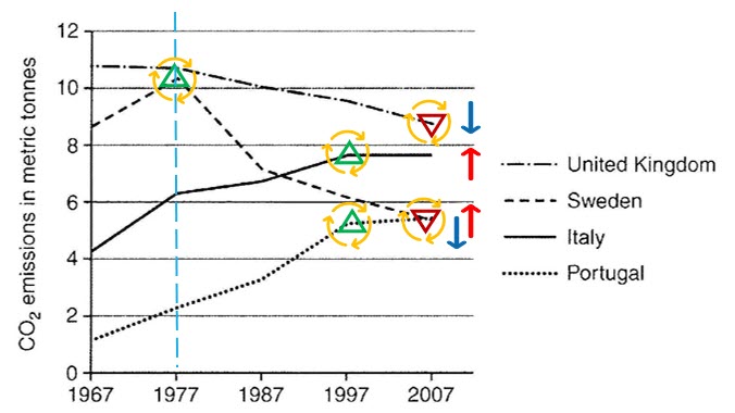
- Mũi tên là xu thế tổng – dành cho viết overview
- Tam giác hướng lên / xuống – là các Main Features thể hiện sự xu thế Tăng lên điểm cao nhất hay Hạ xuống thấp nhất của mỗi đối tượng
- Hình tròn – các Main features cần liệt kê khi viết.
- Hình cột nét đứt – thể hiện sự chia đoạn để viết detail.
|
The graph below shows average carbon dioxide (CO2) emissions per person in the United Kingdom, Sweden, Italy and Portugal between 1967 and 2007. Summarise the information by selecting and reporting the main features, and make comparisons where relevant. |
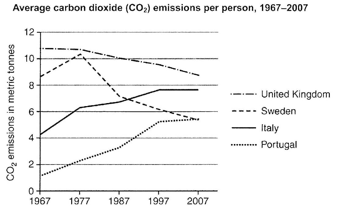
The line graph compares the average amount of carbon dioxide released by a person in four different countries over a four-decade period starting from 1967 to 2007.
It is clearly seen that the emissions of carbon dioxide in Italy and Portugal underwent a significant increase, while those figures for the United Kingdom and Sweden plummeted swiftly over the period shown.
In the first ten years, the amount of carbon dioxide emitted in the United Kingdom stabilised at nearly 11 metric tonnes. A different trend was seen for the remaining countries whose figures rocketed considerably to well over 6 metric tonnes in Italy, 2 in Portugal, and 10 in Sweden by 1977 with Sweden’s figure reaching its highest point.
From 1977 to 2007, carbon dioxide emissions underwent a dramatic slump, bottoming at around 9 metric tonnes in the United Kingdom and 5 in Portugal. In contrast, those figures for Italy and Portugal continued rising dramatically, hitting their highest points of nearly 8 and 5 metric tonnes, respectively by 1997 before leveling off at those levels in the last ten years.
(179 Words) – ieltsgiang.com